
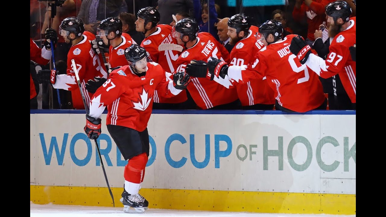
As you may have heard, the NHL will be changing jersey providers next season to Adidas, and with it will come some definite new jersey designs. The last time we saw a mass takeover by a new vendor in the NHL, we were “blessed” with Reebok and their edge system, which could be summarized by “When the NHL added a crapload of piping to their jerseys.”
So with the Adidas takeover, there’s plenty of reason for skepticism, and knowing Adidas’ penchant for adding a particular number of a particular feature to things… Fans of hockey aesthetics all over the globe have been a little worried, and perhaps rightfully so.
With that in mind, here are my humblest of requests for Adidas. This entire season on the Giles and the Goalie Podcast, Giles and myself dreamed up our requests of Adidas, hoping to reason with a league that has been trending in the wrong direction on good looking jerseys for roughly 25 years. I know it’s probably too late, and the bad jerseys are already being sewn somewhere in Asia, but maybe, just maybe, my cries will be heard, and we can save ourselves from just one bad jersey. It’s happened before.
Atlantic
Boston Bruins: The Bruins have actually been reported to be one of 12 NHL teams to have a jersey change on the way. While I’m fine with their current set, perhaps simplifying things and going back to a simpler time would be best. Just, you know, no more dismembered teddy bears.
Buffalo Sabres: The Sabres are reportedly going from navy blue back to royal blue, which is great, but I, for one, have never loved their classic logo that much. Now, if you just took some MS Paint to those sharp Hasek-era jerseys, however…
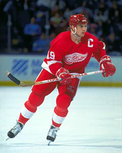
Detroit Red Wings: The Red Wings probably won’t change much, and that’s a good thing.
Florida Panthers: The Panthers are oddly included in the dozen teams confirmed to make changes next season, just one year after a complete branding overhaul, which is…odd. The changes may be as simple as extending their Canadiens-knockoff stripe all the way around their jerseys, or they may have remembered that they’re a hockey team, and might be ditching the soccer look altogether. I would like to see them ditch the ‘Nala from the Lion King’ logo, but shelving it one year after debuting it might be a bit much to ask.
Montreal Canadians: Not rumored to be changing, thank god.
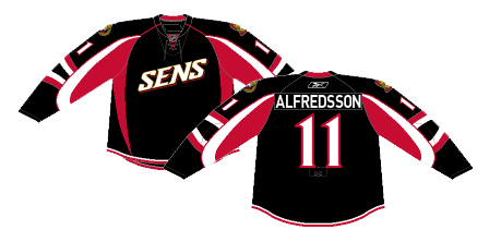
Ottawa Senators: The Senators ARE getting new jerseys, hurray! No telling if they’ll look more like the polarizing ‘O’ third jerseys they currently rock, or the statuesque gladiator primary jerseys. Hopefully it’s something new and exciting, or hopefully it’s something at least mildly interesting. Hopefully it doesn’t at all resemble a video game system box.
Tampa Bay Lightning: The Bolts have cleaned up their image under Stevie Y’s watchful and appreciative-of-simple-jerseys eye. Keep it up. Dropping the current thirds is probably addition by subtraction, too.
Toronto Maple Leafs: The Leafs changed logos last year, which was kind of a big deal for such a historic franchise. Other than the hidden buttocks, it’s a solid look, and they won’t be changing it with the old-school crowd of gentlemen at the reigns there.
Metro
Carolina Hurricanes: The Canes won’t be making any changes, and it’s just as well, since even I can’t think of something to save this blase jersey history. They could just do everyone a solid and move back to Hartford, or to Quebec City.
Columbus Blue Jackets: Good news, the Jackets will be getting a rebrand this summer as well. While it’s unlikely that it’ll involved surly Union bugs, one can only hope that they come up with something Cannon-based, since they’ve carved out a pretty decent identity with that.
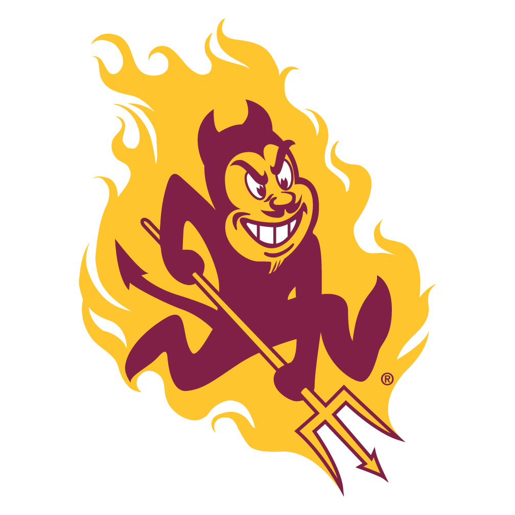
New Jersey Devils: In somewhat surprising news, the Devils waited a whole two seasons after noted jersey grump Lou Lamoriello left to make a change, and they’ll be featuring a new look. I doubt it’ll be anything extreme, but maybe they should skew more towards current Arizona State than former Arizona State, perhaps?
New York Islanders: The Bastard Children of Brooklyn are not making any changes this season, and maybe that’s smart, considering they’ll likely be in a new home sooner rather than later. And much like Tampa, losing their black third jerseys is a plus, and perhaps a fitting tribute to their relationship with that particular borough.
New York Rangers: Don’t. Change. Anything. (But if you do please bring back the Liberty jersey.)
Philadelphia Flyers: Not much needs to change here. Giles has voiced his distaste for the off-colored name panels, and I agree. Also, Giles says fire Dave Hakstol.
Pittsburgh Penguins: The move to ditch Vegas Gold last season was a welcome one, and hopefully these Penguins jerseys are around for a long time. Beautiful.
Washington Capitals: The Capitals aren’t rumored to be getting a jersey change per se, but they’ve sent out surveys to their season ticket holders asking them if they prefer the alternate red throwback jerseys to the current red ones when the team has to drop a jersey for next season. The answer is yes, yes, a thousand times yes.
Central
Chicago Blackhawks: No changes for Chicago, and we should all be quite pleased with that.
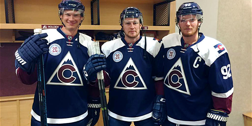
Colorado Avalanche: As one of the few teams still clinging to their piping-riddled Reebok edge jerseys, it’s wonderful news that the Avs are making changes this summer. While what changes those are remains to be seen, I actually wouldn’t mind them leaning more towards their current third jerseys than their burgundy threads of the past.
Dallas Stars: The Dallas Lone Stars are also on the list to be making changes this summer. It is unknown if they’ll rightfully give back the North Stars nickname to Minnesota, however.
Minnesota Wild: This has been a topic of much debate on many media fronts with season in the State of Hockey, but the Wild are going to have a ‘rebranding’ of sorts. While I don’t think that many of the colors or logos will be drastically overhauled, we do know that the new jersey set will be green and white, and perhaps use the original logo, as the Stadium Series jerseys did last season. Cautious optimism is the best way to approach this, Wild fans.
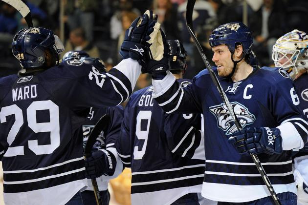
Nashville Predators: Also on the list for a reboot is Smashville, which is interesting, because they seem to be all-in on this yellow thing. I hate it, but wouldn’t actually mind if they used yellow as a light colored jersey, which would be even better if teams wore their light jerseys at home as they should, but I digress. I didn’t hate their old blue jerseys, so they would be a welcome return to the fold for me, but you don’t ever always get what you want. As long as they don’t make the transition from French’s back to Grey Poupon, I think we’ll be okay.
St. Louis Blues: I think everyone is a low-key fan of the Blues’ look. They’re not changing anything, so that’s good.
Winnipeg Jets: The Jets won’t be going back to the classics anytime soon, so I guess we’ll just have to live with this moderately attractive/moderately boring set they sport now.
Pacific
Anaheim Ducks: Look, we all know what needs to happen here. Arguably the worst jerseys in hockey need to go bye-bye, and the classics need to be re-installed. I don’t even care about the color palette anymore. Allegedly, the Ducks are switching to orange as a primary color, not next season, but rather in 2018, which is baffling. Again, don’t care — as long as they’re using the right logo.
Arizona Coyotes: The Coyotes aren’t making any changes this summer, but if they did, they should totally use this logo.
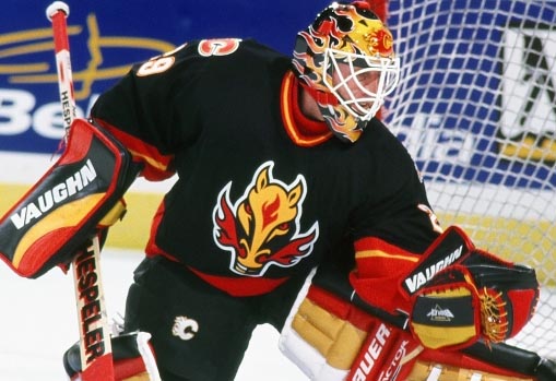
Calgary Flames: The Flames are on the list! While it’s uncertain if they’ll be going more towards the lovely retro look of their third jerseys, one can only hope. Black never looked good on you, darlin’.
Edmonton Oilers: In perhaps the most disturbing news of the summer, the Oilers will be going with an orange primary jersey next season. One can only wonder what fans have done to deserve this, but rest assured the hockey gods cannot be very happy.
Los Angeles Kings: The Kings are blessed with a pretty solid jersey history with a few glaring exceptions, but I rather like the latest iteration. I love love love the Gretzky eras and enjoy the classic ‘Forum Blues,’ but they’re sticking with these, and that’s good.
San Jose Sharks: No changes coming for the Sharks, which is too bad, because despite having a pretty solid look, I think they could stand just a little tweaking. Losing the black jerseys next season isn’t a huge loss, at all.
Vancouver Canucks: The Canucks have had quite the history of changing jersey styles but are not going to make any changes this summer, which leads one to wonder what dumpster fire they’ll come up with next. I’m partial to the now incredibly dated flying skate jerseys, but if they should redesign, they should ditch Shamu and go with something simple, or feature Johnny Canuck more prominently.
Vegas Golden Knights: The 13th new jersey in the NHL this summer will be that of the expansion Golden Knights, who missed out on several awesome opportunities at a better nickname and logo, but alas. There are plenty of guesses as to what the new VGK jerseys could look like, with this being a pretty likely model, but no one knows (until they’re leaked a few days before the reveal).
All in all, we’re poised for a very exciting week later this month with most of the jersey reveals happening around draft night. Look forward to, hopefully, some jersey upgrades coming to NHL arenas next fall, or in the Wild’s case, hope for something not worse than the previous set.
