August NHL news leaves a lot to be desired, so this summer I’m tackling a fun topic much more exciting than arbitration filings and AHL signings.
The NHL made the full jersey switch to Adidas last season, and much like when they went to Reebok, the third jersey program was scrapped for a season while teams got two new jerseys each.
With the program restarting this season, a handful of teams have dipped their toes in the third jersey waters so far, but most of the league still hasn’t decided on a third jersey. So I took the liberty of finding or designing a third jersey for nearly every NHL team, even those who have already announced a new design.
I started off with the Atlantic Division, and this week I’m tackling the Metropolitan Division.
Carolina Hurricanes
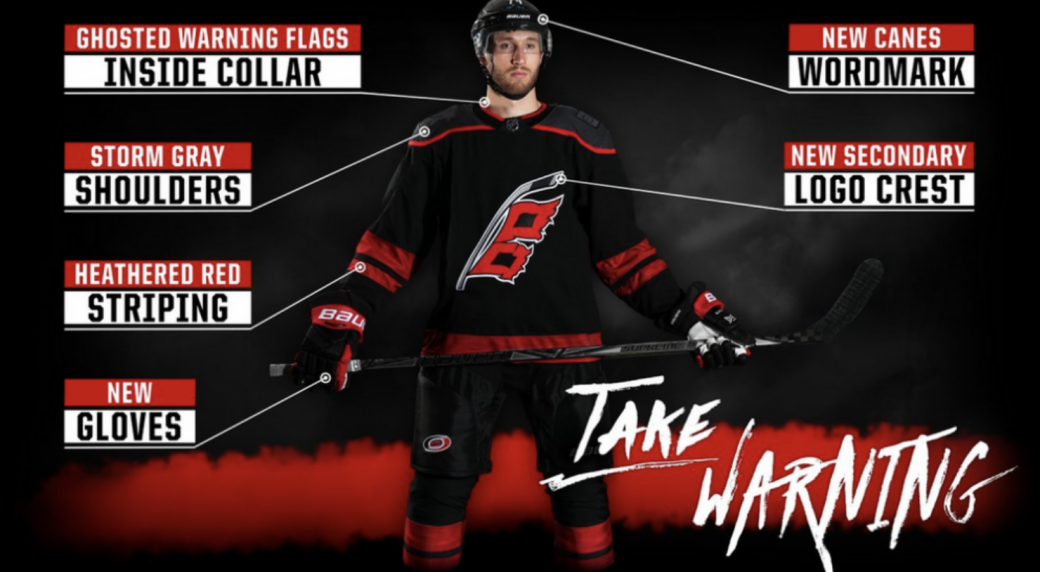
The Hurricanes actually came out with a new third jersey design this summer, and after I got done repeatedly rolling my eyes from all the ‘ghosted’ things on it, I designed this to replace it.

The primary logo they’re using now isn’t bad, and even though it’s a little too tall and thin, I like that they corrected the old one flag logo — which actually represents a tropical storm — with the two flags that represent a hurricane.
I also dig their use of negative space between the flags being the shape of North Carolina. Along the lines of negative space, I found a concept logo from icethetics.com that I morphed into a new border, mimicking the hurricane flag bordering that they have used. I especially liked doing all of this for a franchise that is known for its negative space.
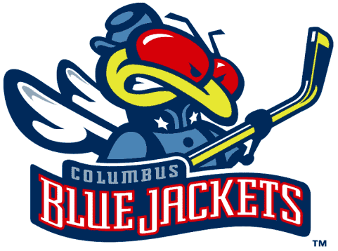
Columbus Blue Jackets
The Blue Jackets made a semi-right move in reinstating their former cannon-themed third jersey this offseason. What gets me about the Blue Jackets is that they still haven’t accepted that the cannon is their team identity aside from those jerseys. Truth be told, I’m not huge on the roundel logo that they use for the third jerseys anyway, even though it does feature their cannon.
So what I did was deconstruct that logo a bit, and made the cannon the slap-in-the-face feature logo that it deserves to be. I also moved the single star that they use for space filler to the shoulders, reminiscent of a military uniform the team is named for (we think?).
I also ran stripes down the arms lengthwise as the team has always done throughout its history, and made them red and white striped like the Ohio flag that they love so much. If this jersey doesn’t scream “We like military cannons!” I don’t know what does.

New Jersey Devils
No longer under the aesthetically curmudgeonly thumb of Lou Lamoriello, the Devils made a slight tweak to their jerseys when Adidas took over, removing their tail stripe and changing the sleeves. Well, it’s about time they enter the third jersey party for the first time. But to keep heads from rotating around on shoulders, I’m just suggesting that they fill red with black, and call it a day with a nice and simple look. No need for cartoony demons.

New York Islanders
The Islanders had such a good jersey history until this infamous fella came along. So I wanted to do something that honored that history with something new and fresh. So I inverted the colors of the logo, and I think it’s a nice way of making something new without going bananas, and I used the exact same striping from the 1978-84 jerseys that won four Stanley Cups.
One feature from those Gorton’s Fisherman jersey that I honestly really enjoyed was the lighthouse shoulder patches, so I made sure to include them with the proper colors. You’ll notice there’s no nod to Brooklyn here, because why honor someone who doesn’t love you?

New York Rangers
If we’re gonna do this, do it right. No debate.

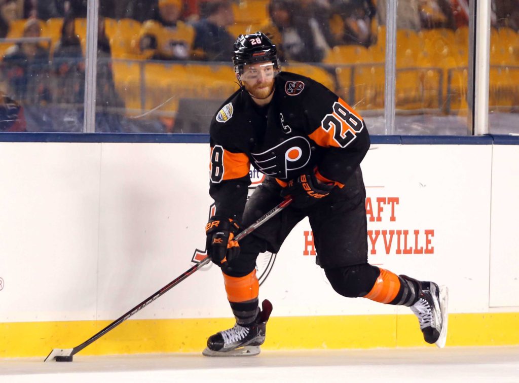
Philadelphia Flyers
So if you were paying attention this summer, the Flyers DID actually come out with a new third jersey, albeit one that’s basically their Stadium Series jersey from last season. It’s painfully simple, and leaves everyone wanting more, myself included. Given the handsome and mostly steady — until Reebok came along — tradition of Flyers jerseys, I figure if you’re going to go with a black jersey, which makes sense even after the 90s, go with one that actually looks good.
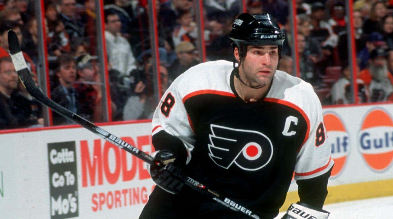
Pittsburgh Penguins
The Penguins have gone through a ton of jersey tweaks throughout the years, so there’s plenty to choose from as far as history is concerned. Did you know that navy blue was the team’s primary color for three seasons? Anyway, If they’re going to do a third jersey that’s a throwback, or at least designed based on a throwback, as all of their third jerseys have been, they should go to a jersey with a short lifespan but an iconic look, thanks to these two fellows.

Believe it or not, that jersey from the 90s that replaced the beloved skating penguin in the first place was actually sort of a throwback to the Penguins’ first-ever jerseys, just in their current colors. What’s old is new and what new is old! Isn’t history fun?
Washington Capitals
Giles is right.
Become a Zone Coverage Member Today!
