The Minnesota Vikings have worn their current uniforms since 2013, and despite having a solid, yet modern look, there are still some people who feel like they need an upgrade or another overhaul to go back to their uniforms of yesteryear.
Of course, adjusting your uniform is making your franchise a target in a world where sports is non-existent. With seven teams announcing new uniforms prior to the start of the 2020 season, there have been cases of teams like the Atlanta Falcons and Los Angeles Rams going way too modern and other teams like the Cleveland Browns and Tampa Bay Buccaneers erasing their previous mistakes by going back to a more classic look.
When it comes to the Vikings, their uniform history has been pretty simple. If they were to do an overhaul, it would make sense to invoke their previous iterations and turn it into a slightly modernized, but still “old school” look. Here, we’ll take a look at some of the best, and perhaps more interesting, combinations in Vikings history and what it should mean if the Vikings do decide to spruce things up a bit down the road.
Road Whites (1970-95)
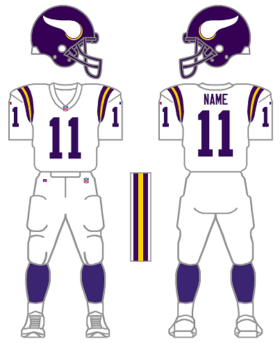
One of the combinations that should be brought back is the classic white-on-white look. With the current uniform set, the Vikings haven’t worn white-on-white since the opener of the 2015 season. The 49ers destroyed the Vikings by a score of 20-3, so it would be understandable if this look was ditched for the same reason the Twins 1997 “Dairy Queen” jerseys were scrapped after two games.
But the white-on-white look is something that spans all the way back to the early days of the franchise. By keeping the purple and white shoulder stripes, it would be a tip of the cap to a tradition that was established in 1970. The Vikings introduced yellow trim to the numbers in 1996, but keeping it off would keep a nice throwback look with the old block numbers.
As either an alternate or a “color rush” (although that term was discontinued in 2018), an old school road jersey would be a nice addition to a new look.
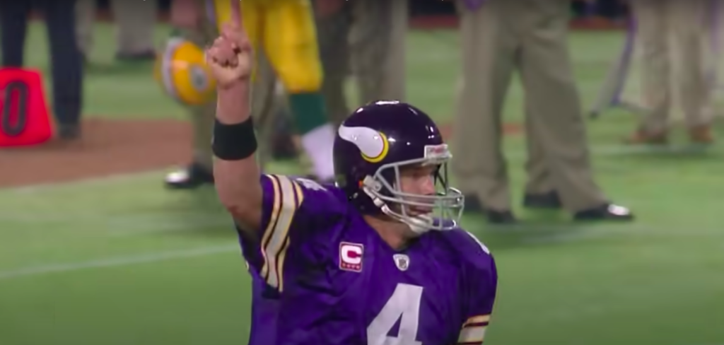
Throwback alternates (2007-11)
These jerseys are known today as the “Brett Favre Jerseys” thanks to the 2009 Vikings-Packers Monday Night Football matchup at the Metrodome. However, it’s a more modern hybrid of what the Vikings wore during the “Purple People Eater” days.
The purple jersey with the white numbers is a simple look. Although the Vikings added gold trim to their numbers in 1996, it almost gave the look that they were wearing misprinted Kansas City Chiefs uniforms. The purple and white just makes it feel like it’s their own. A lot of people are also fans of the gray face masks, but it’s something that can be lived without in a potential redesign.
The reason this isn’t listed as a 1970s throwback is because of the collar, which drops into a V with modern uniforms, but was pressed back up to the neck back in the ’70s. The Vikings already have this look with their current set with different numbers, and going back to more traditional block numbers might not make a huge difference, but enough to give it a leg up on what they have.
The Epic Fail (2006-12)

Throughout Vikings history, there haven’t been many radical re-designs to their uniform, but this set is a warning what thinking outside of the box can do.
The Wilf family took over the Vikings in the 2005 season and wanted to put their stamp on the organization with a new look. Trying to go more modern (in the less than modern Metrodome), the Vikings whipped out these bad boys and proceeded to burn our retinas for the next decade.
There isn’t enough bleach in the world that could make us unsee this set with the stripes (that were supposed to be Viking horns) and the side panels, which rarely line up the way they’re supposed to during the course of a game. Adrian Peterson made these jerseys famous, and that’s unfortunate because they were that bad.
What could the Vikings do next?
The last set of uniforms is a reminder of what has happened with some team’s uniforms. When Nike took over NFL designs prior to the 2015 season, there were several teams who wanted to become “The Oregon Ducks of the NFL.” A couple of uniforms with alarm clock numbers and way too many uniform combinations later, teams have inched toward erasing their mistakes and pretending it didn’t happen.
Some Vikings fans want to add black jerseys or throw together some kind of re-design, but the truth is, it isn’t that bad. I’m sure the Rams had the idea of going with a tweaked version of their blue-and-yellow scheme, but a Nike designer walked in, blasted a trap horn and suddenly they have letters befitting of a 1990s denim jacket.
The Vikings don’t need a black uniform (they’re not the Ravens) and they don’t need some radical color scheme. Sure, teams like the Dallas Cowboys have cool alternates, but they are nods to their past, which is something the Vikings have. If they stick to what they know, the Vikings uniforms are just fine.
Graphics in this post via gridiron-uniforms.com.