Let’s get one thing clear. The Seattle NHL franchise had four months of no sports to deliver their new name, logo and uniforms but waited until MLB Opening Day to drop the news. Horrible delivery on their part.
But once we got a glimpse of what they had held out on us, oh boy, was it ever so good.
The name ‘Kraken’ is up for debate in hockey circles as a worthwhile name — it is more commonly associated with the rum brand — but that’s more up to the fine people of Seattle if they love it or not. At least it’s unique and we actually know what kind of animal it is, unlike the name of the team that resides in St. Paul.
https://twitter.com/NHLSeattle_/status/1286334190439395330
The logo is very well done, at least for an NHL expansion team. The Vegas Golden Knights were the last expansion team, and they killed their logo debut as well. But look at the four teams that came before them: the Nashville Predators, Atlanta Thrashers, Columbus Blue Jackets and Minnesota Wild. Not exactly cream of the crop for debut logos.
The Kraken logo is sharp, has unique colors and incorporates the city that it represents with the ‘S’ shape. Please, cut it with the ‘Seagram’ gin logo comparisons.
Then we got a glimpse of an alternate logo the team will use, and this was instantly one of the best logos in all of sports. It’s that good.
Incorporating the iconic Space needle as the top of the anchor is genius. The Sonics have company for the best logo in Seattle sports history. Chef’s kiss.
Usually, when a team is debuting their new name and logos, they stop right there. They wait until it’s close to their debut to release their first uniforms. But not Seattle. They dropped those in as well, and it was even better than you could have possibly imagined.
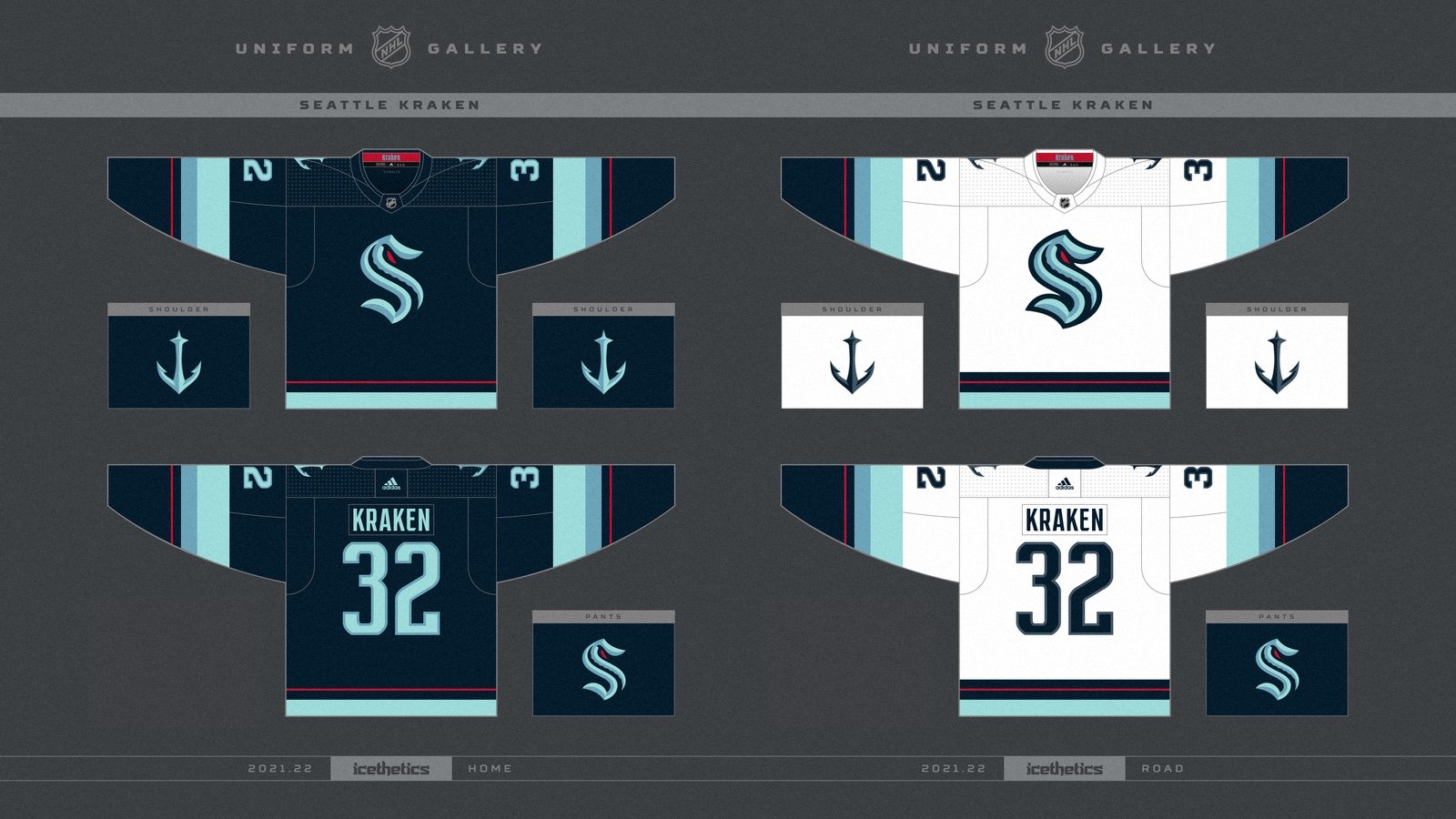
Some people are not enthused about the home uniform having all those different colors of blue, but it’s fantastic. It is also unique and does not have generic colors that you see among most NHL teams. The different shades of blue are another nod to the City of Seattle.
Then they dropped in the road uniforms, and instead of getting fancy with it, they just inverted the home uniforms, and it is absolutely the best of the pair. The base white with the different shades of blue on the sleeves and at the bottom with just a pinch of red is a great mix of colors. Then add in the crest and the alternate logo on the shoulders, and you have a great jersey set.
Then just think of the different glove/breezer/sock combinations you can have with the different shades of blue. Bauer Hockey tried to give a hint of what the gloves would look like when the team hits the ice in 2021.
Say what you want about the name Kraken, but Seattle crushed the launch of their identity. They followed the great launch of the Vegas Golden Knights and maybe even one-upped them.
Now that this is out of the way, can the Kraken follow the Knights in terms of drafting one hell of a team in the expansion draft?