Nothing quite kills the negative buzz of a Monday morning quite like a jersey drop by all 31 NHL teams. That’s exactly what the NHL and Adidas did on Monday morning, dropping their much-anticipated line of ‘Reverse Retro’ jerseys.
We will get to the rest of the league later, but we are going to lead off with the Minnesota Wild, who featured a jersey out of the North Stars history.
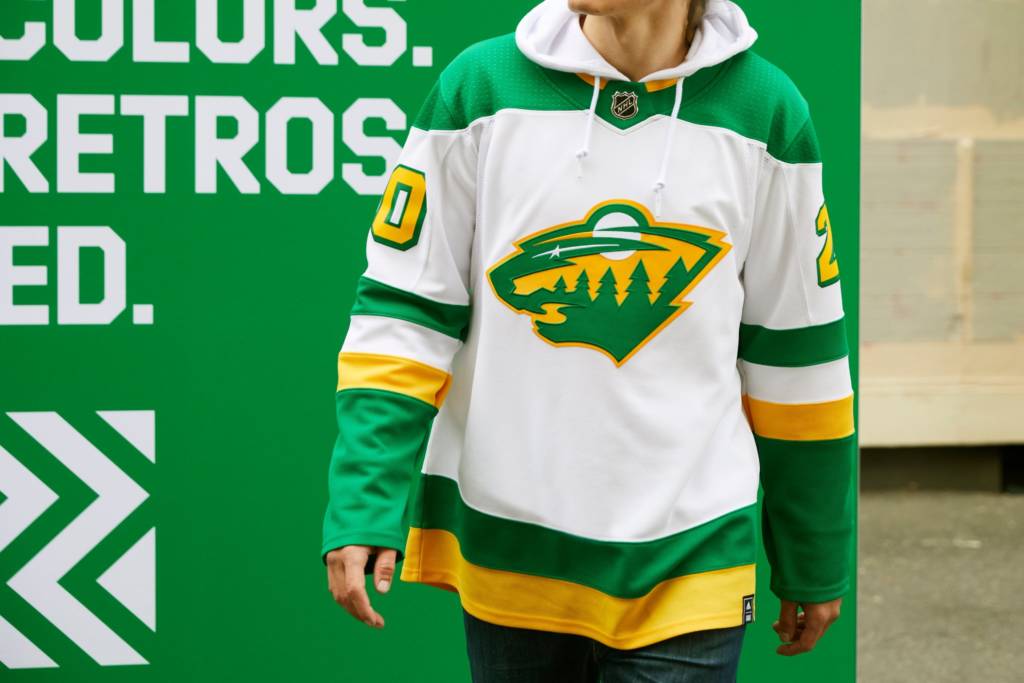
After we tried designing the concept last week, the actual result is a bit disappointing. Before we answer why, let’s review some reporting from Michael Russo’s story in The Athletic on how the jersey came to be: “While some fans had hoped for the Wild’s classic “M” to replace the North Stars’ “N” on the front, that was actually never discussed between the team and Adidas. It was always going to have a Wild logo on the crest.”
The crest is the point of emphasis on any jersey, and this seems like a huge oversight on both sides. The North Stars have a jersey history of great classic looks for all but two years of their existence. The ‘M’ is as classic as it gets in terms of Wild logos, and it seemed like a no-brainer to drop that as the crest. Classic jersey, classic crest with the Wild touch you wanted to differentiate the Wild and North Stars. Right?
Wrong.
The bear-head logo just seems off with green and gold colors. It also just seems off on this jersey, period.
The yellow numbers with green trim is a reverse of what you saw on the North Stars jerseys in ’78, so that is an understandable design twist to, again, differentiate the North Stars and Wild. But putting this much primary yellow on a white backdrop just doesn’t look that good on the eyes (yeah, looking at you too, Nashville!). Perhaps this will get better over time when you see them on the ice. But, blargh.
The primary design of this jersey is solid. But the details of the crest and numbers just throw it off for my taste. At least there are no errant shoulder patches, piping, or anything else that was wrong with jerseys before. So we can all be thankful for that.
Let’s check in with a former podcast co-host, who had some words to share on this as well:
It feels like Adidas’ Reverse Retro’s theme was “Almost what you wanted.” This applies to nearly all NHL teams, the Wild being no exception. While many fans were calling for the new-ish ‘M’ logo, Adidas was mostly unwilling to promote any shoulder patch logos to crests for teams, save for the Vegas Golden Knights, who obviously don’t have much history to pull from, and just introduced a bonafide third jersey with their existing crest logo as well.
Personally, I would’ve loved to see the Minnesota script on these jerseys for something new, and saving the M logo for the new third jerseys the Wild have also promised are coming soon (not to mention they undoubtedly already had a Winter Classic jersey in the works that will now be delayed a year…).
All in all, the disappointment of the Wild bear-head logo being on these jerseys kind of pales in comparison to the branding confusion that this is going to create. This reverse retro was a one-off gimmick from Adidas and the NHL, but now Wild fans, who have never been able to let go of the North Stars name, logo, etc., will expect more shenanigans like this.
Going forward, every time a new jersey is announced by the Wild, fans are going to clamor for the Green and Gold, and even more classic ties to the dearly departed. Or worse, the nostalgia will gain enough steam to create a movement to rebrand the actual Wild colors completely to Green and Gold, which sort of undoes 20 years of marketing from the current NHL team in town.
For comparison’s sake, let’s do a quick review of the rest of the league.
Anaheim Ducks: Never thought I’d live to see the day when Wild Wing returns, but here we are!
Arizona Coyotes: WELCOME BACK SPACE COYOTE! Purple jerseys are a great look with this!!
Boston Bruins: Going back to the Bourque-era jerseys from the 80s was a good idea. Yellow usually doesn’t work, but the design makes it work here.
Buffalo Sabres: Wrong jersey from ’98 to go off of. Why did you go this route?
Calgary Flames: Another 90s jersey that was left for dead making a return.
Carolina Hurricanes: Very good. Classic Whalers design. Didn’t even try to incorporate anything Hurricanes, which is good.
Chicago Blackhawks: Surprised there was anything left to reverse since they used all their retro jerseys on outdoor games.
Colorado Avalanche: Denver adopting the Nordiques and the Fleur-De-Lis is a bold move. Condolences, Quebec.
Columbus Blue Jackets: Hey look! A 2000 expansion team that was not afraid to just reverse a jersey from its own history!
Dallas Stars: LOL
Detroit Red Wings: Horribly boring.
Edmonton Oilers: More orange is not what this team needs.
Florida Panthers: The white kind of kills it here. Otherwise a solid jersey.
Los Angeles Kings: Combining their first two jersey-eras was genius. Best one out of the pack.
Montreal Canadiens: Primary blue just looks wrong on the Canadiens.
Nashville Predators: Speaking primary blue again, here’s Nashville, missing that color once again.
New Jersey Devils: Predictable, since the Devils have three jerseys to pick from in their history.
New York Islanders: What is reverse about this?
New York Rangers: The long-awaited return of Lady Liberty. Keep her in the rotation permanently.
Ottawa Senators: Not bad. Needs more black trim, though.
Philadelphia Flyers: Good mix of orange and black here. Looking forward to seeing these in action.
Pittsburgh Penguins: Good, but it would have been fun to see a creative attempt at reversing the robo-penguin jersey.
San Jose Sharks: The Sharks did not need this much gray. But I guess that’s all they could go with.
Seattle Kraken: No jersey, but would have been fun to see them give this reverse retro a spin.
St. Louis Blues: Bastardizing the Gretzky worn ’96 jerseys was not a good idea. This is too much red.
Tampa Bay Lightning: Sure, why not?
Toronto Maple Leafs: Like Montreal, Toronto did not need to go this route.
Vancouver Canucks: GRADIENT NEVER WORKS!
Vegas Golden Knights: The primary red works with this crest. Another good one from Vegas.
Washington Capitals: These turned out a lot better than expected.
Winnipeg Jets: Major disappointment from our neighbors to the north.
Top five (in no particular order): Los Angeles, Washington, Columbus, Carolina and New York Rangers
Bottom five (in no particular order): Vancouver, Detroit, Nashville, St. Louis and Dallas