*ahem*
Enough chit-chat. Let’s get to the list.
Note: This is a really good field. So just because a team finishes low on the list is not a knock on them, it’s just how incredible the threads were this year.
8. Mankato East Cougars
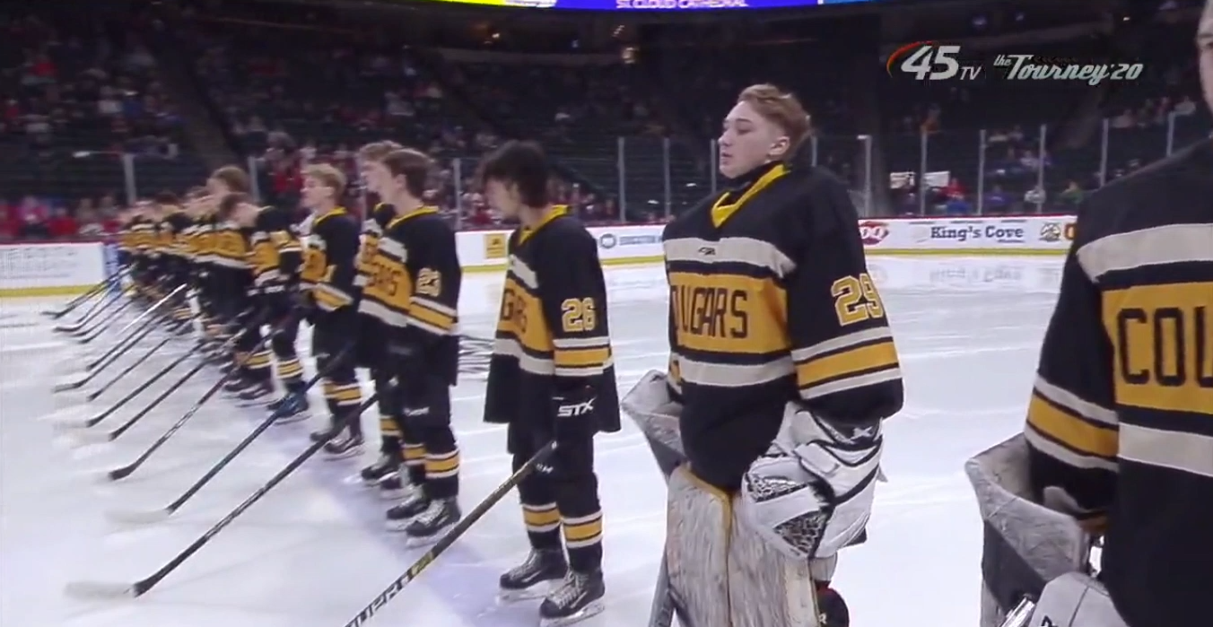
Three stripes across the front is a bold move. It gets even bolder when you have one of the stripes being much much larger than the others so you can get ‘Cougars’ in it. The ‘Cougars’ is just too bland for me. While watching East in Wednesday’s game, I said they wouldn’t be the worst of the day. But I had no idea what everyone else was bringing. Also, this was a team in our last edition that came in No. 1. WHY DID THE GOOD ONES FALL TO THE WAYSIDE?!
—
7. Monticello Moose

I like the Moose crest, but it’s a near replica of the Manitoba Moose crest. If you are going to knock off a Moose crest, knock off the Minnesota Moose. That’s a jersey that does not get enough love around these parts. The jersey also is a base template of the Ottawa Senators, and I have to ask why? Ottawa is a hot mess right now and for the foreseeable future, and their jerseys are not overly inspiring with the stuff below the arms. So steer away from that, please.
—
6. Mahtomedi Zephyrs

Six through one is where the field really separates from the bottom and could be easily interchanged. Mahtomedi checks in here though because they really make you aware of the Trojan or Zephyr? There are four instances of that logo on the uniform. Two on the shoulders, one on the small patch above left of the crest and one on the crest. The crest one sticks out as excessive, but if there weren’t as many elsewhere too, then this jersey would be much higher up.
—
5. Hutchinson Tigers
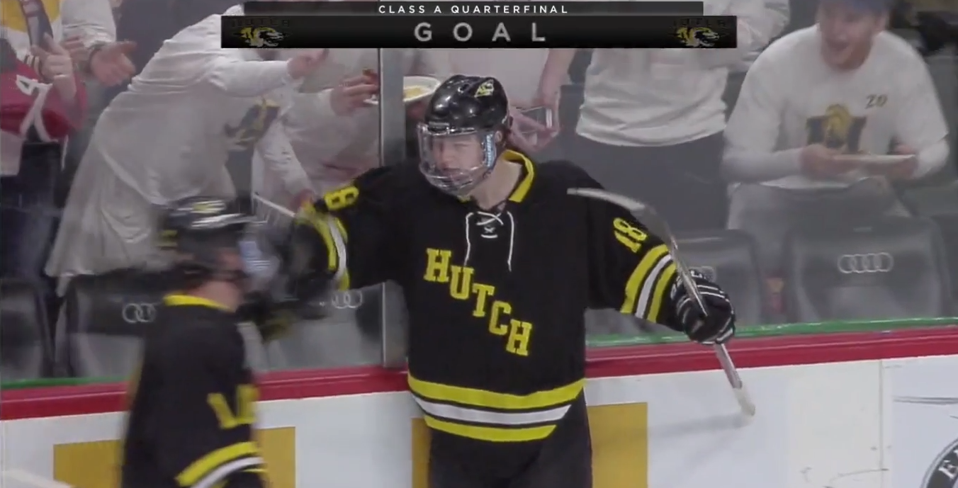
Simple. But almost too simple. The base design is good, but it needs a stronger crest than ‘Hutch’. Still, not bad at all.
—
4. Delano Tigers
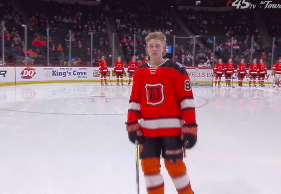
The state flag on the shoulder is a nice touch. Old style looking ‘D’ is a good crest. If I had to make one change, I would maybe get rid of the black shoulders. But otherwise, this is a good look for orange and black as primary colors.
—
3. Hermantown Hawks

This is where the field really separates, but since everyone is sick of giving Hermantown Class A titles, they do not take top honors in the jersey category. I kid, I kid. This is a great look for Hermantown, and I appreciate the three stars on the back of the collar which I’m guessing signifies state championships.
—
2. St. Cloud Cathedral Crusaders

Simple and elegant. The defending champs haven’t touched their uniforms in a while and that’s okay because nothing needs to be changed. When something is not broken, leave it alone. Good, good, good.
—
1. Warroad Warriors
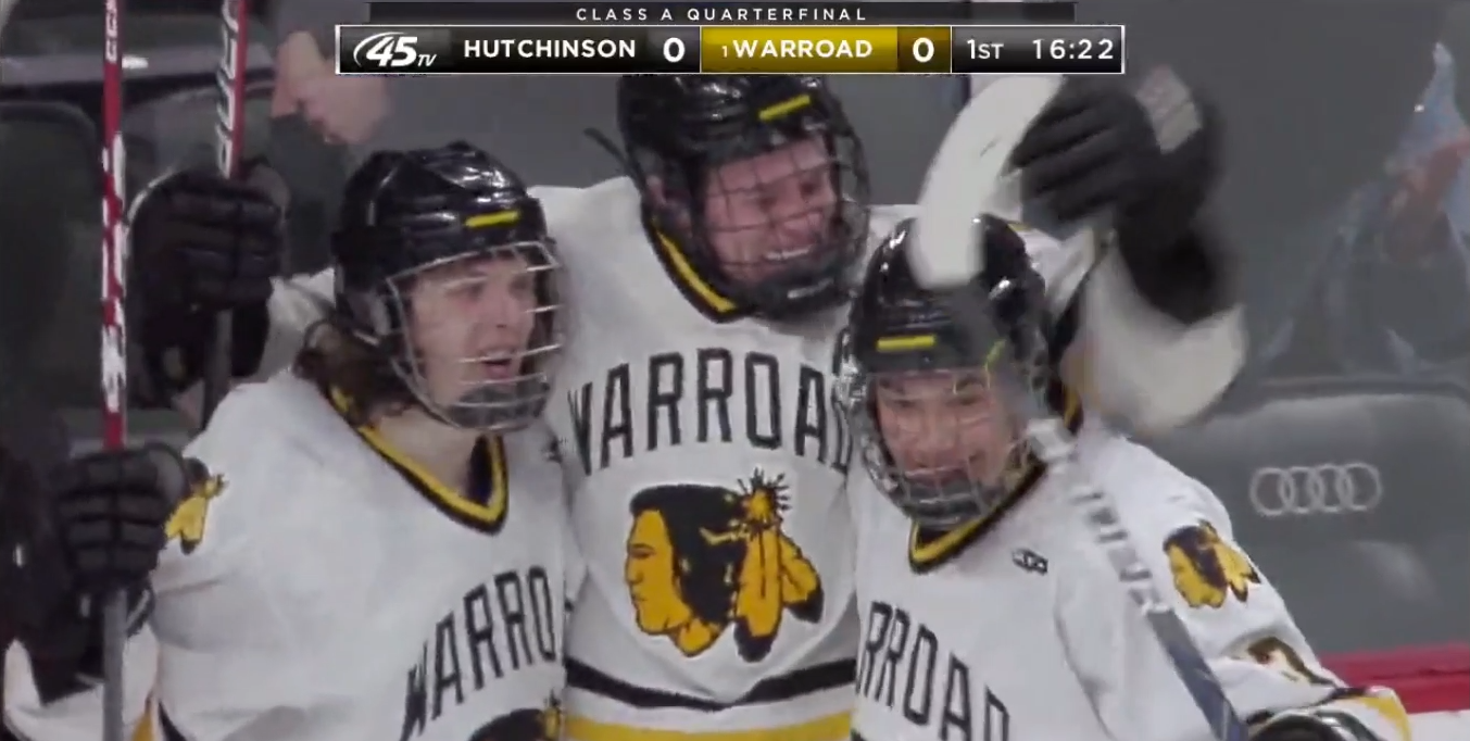
This is a tournament of tradition, and Warroad’s jersey is one of great tradition. It really has not changed over the years, and you have to love that. Again, not broken, leave it alone and so on. Simple stripes, solid crest, grand hockey tradition. Class A’s top seed takes home the top jersey honors in 2020.
CLICK HERE FOR CLASS AA JERSEY RANKINGS