Wednesday was an absolute treat for jersey nerds like myself. Flip the page to Thursday, and well, it was
not as delightful as the Tourney’s opening day.
There was a tremendous amount of debate as to how the teams should rank from Nos. 2-8. There was a clear cut winner, which you’ll find below, but the rest are easily interchangeable, so don’t get mad if your team had a low ranking (looking directly at you, Tom Schreier).
To the rankings:
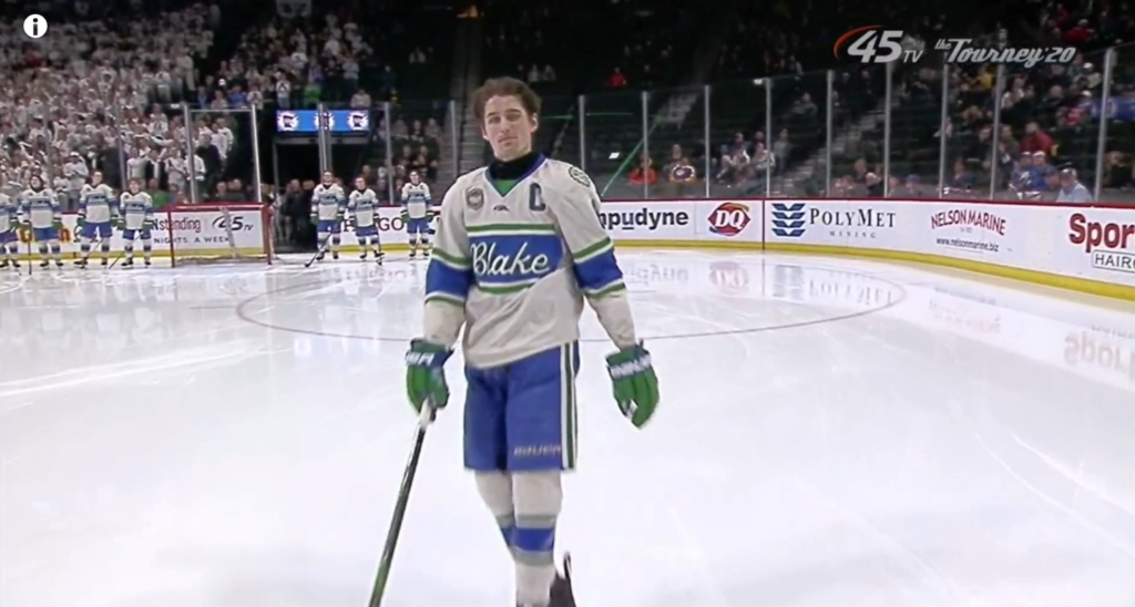
8. Blake Bears
I was first thinking highly of Blake’s uniforms Thursday afternoon, but they did not age well at all with
me. The stripes not going all the way around, cutting off under the arms — is a huge detraction here and
was not seen at first — which is why they plummeted down the rankings. The cream base color is a nice
touch to go with the green and blue, and they have nice patches, too.
But you have to fix the stripes.
—
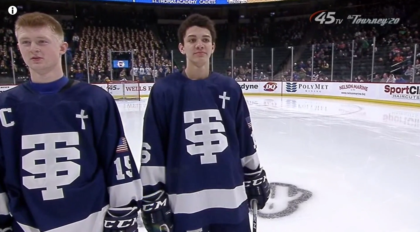
7. St. Thomas Academy Cadets
Simple is always good with jerseys, and the base template certainly is simple with one solid stripe on
each sleeve and at the base. But for some reason, the Cadets tried to pile stuff where it doesn’t belong
and completely overlooked the shoulder areas for extra markings. The cross front right and the
American flag on the arm is excessive, but I get it, they are cadets and the flag stays on the arm. It
doesn’t mean it should go there on a hockey jersey, though.
Note: ZC managing editor and STA alumnus Tom Schreier will be terminating my contract once he reads this article.
—
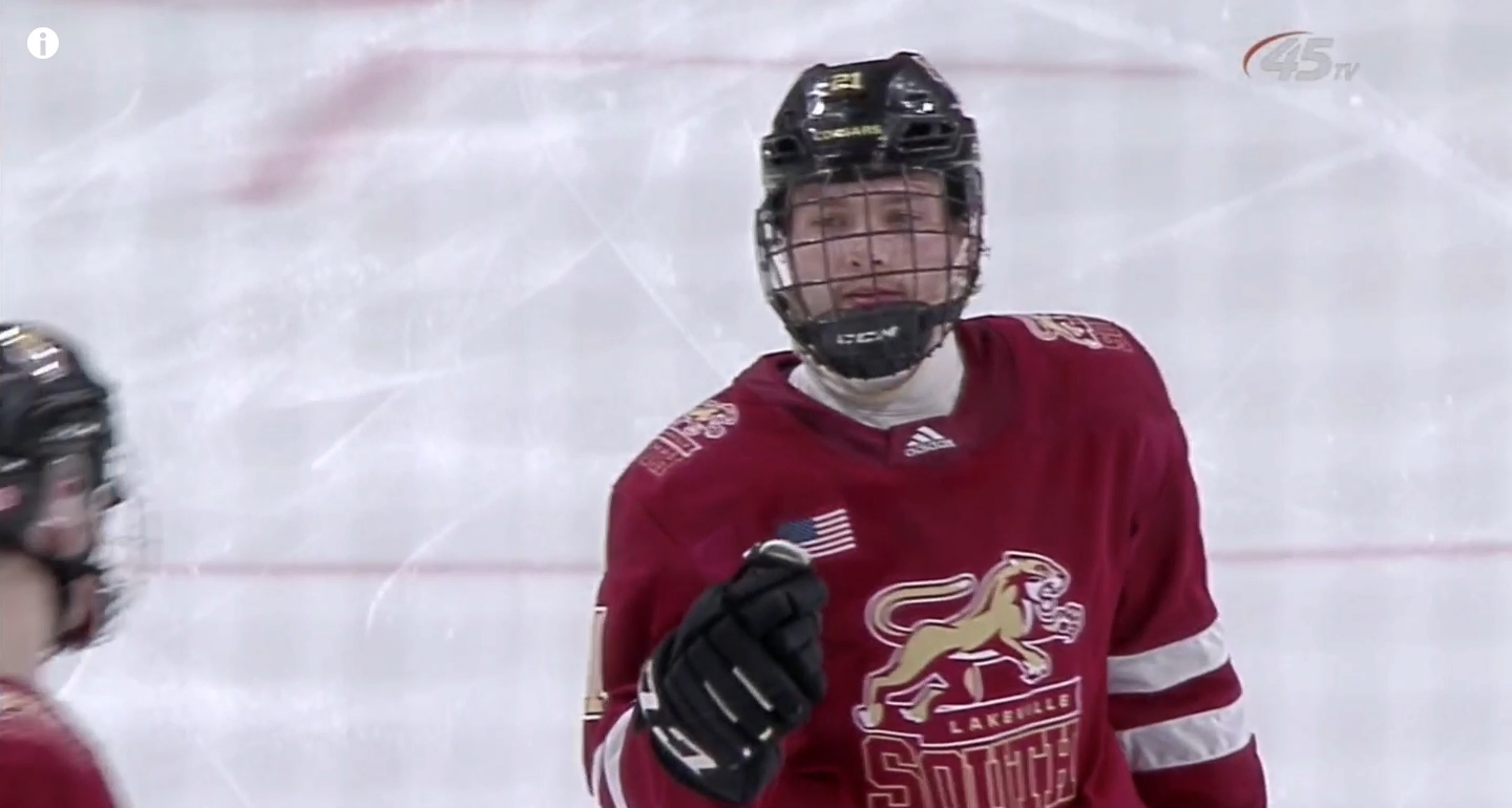
6. Lakeville South Cougars
Honestly, this is a good look for the Cougars. The problem is using the same logo on the crest and on the
shoulders. You need to find something different for the shoulders or come up with a different crest. Do
that, and this jersey flies up the charts.
—
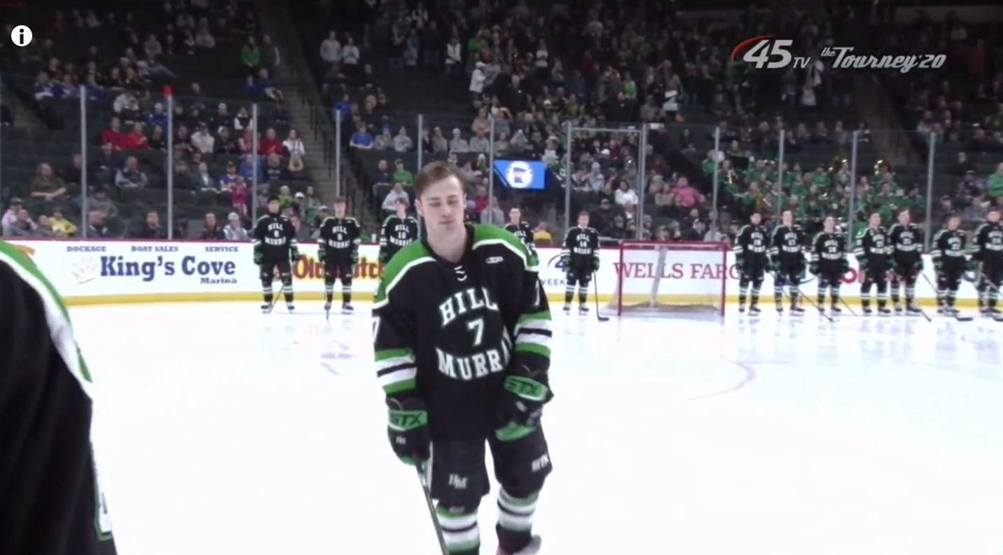
5. Hill-Murray Pioneers
The best thing Hill-Murray could have done in recent years is gett away from the Reebok Edge
jerseys, which they did. They took a model very similar to the North Dakota Fighting Hawks jerseys,
which is not a bad look. Striping on the sleeves seems to be a bit much, though, but otherwise this is a
good uniform for the Pioneers.
—
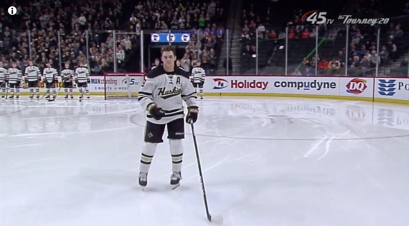
4. Andover Huskies
The Huskies pretty much have the same design as Hill-Murray with the exception of the color scheme. No
shoulder patches, and the color scheme just looks a bit better with this template, especially on a white
jersey. If I had to make a change, I would find something new for a crest. Otherwise, Andover is good.
Too bad they couldn’t get past the Cadets…
—
3. Maple Grove Crimson
Again, same structure as Hill-Murray and Andover. Just a better color scheme, and high marks for the
Crimson using a variation of the Toronto Maple Leafs logo as their crest. It’s a great look that they’ve
applied their colors, too.
—
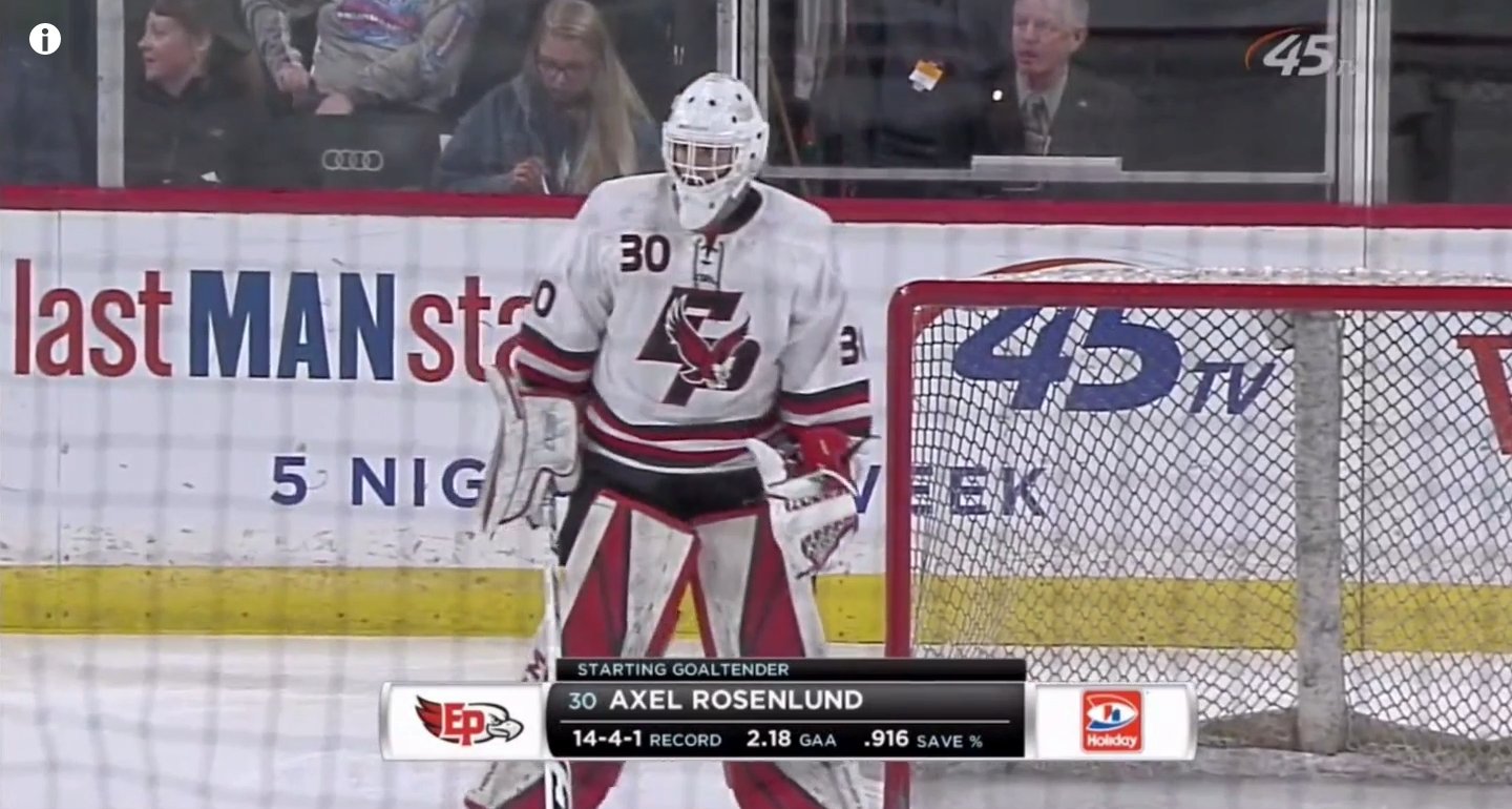
2. Eden Prairie Eagles
If you take the Eagle off the ‘EP’ crest and move it to the shoulders, this is a great jersey. I don’t really
have an opinion on putting names on the jersey like EP and some others do, so that did not factor into
these rankings. Big gap, though, between this jersey and No. 1.
—
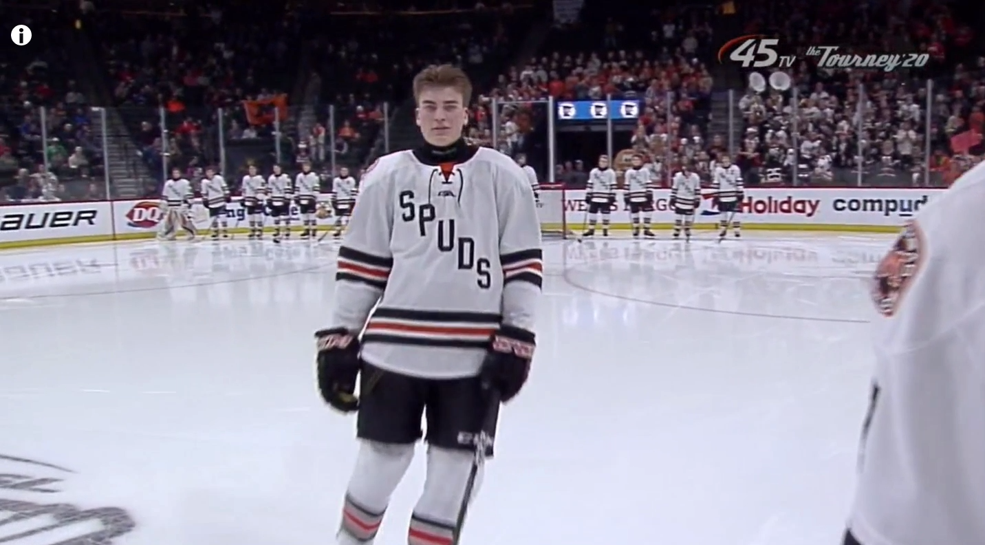
1. Moorhead Spuds
Don’t ever leave this look, Moorhead. Everything about this is perfect. Template, crest, colors and
shoulder patches. Chef’s kiss for the Spuds’ jersey. It’s just too bad they made an early exit.
CLICK HERE FOR CLASS A JERSEY RANKINGS
