Last season was a movie for the Minnesota Timberwolves. They were a young, inexperienced group led by a charismatic veteran overcoming several instances of adversity and ultimately achieved their goal of reaching the postseason. And even though last year’s final act ended in defeat, stars Karl-Anthony Towns, Anthony Edwards, and Rudy Gobert will be looking to help the team have a much-improved sequel season.
NBA teams have a story to tell. Contenders’ tales are typically longer in run-time and are often more action-packed. As for the league’s bottom-dwellers, their 82-games are more like a tragedy. They often bring unwelcome tears to the eyes of their loyal viewers.
Franchises have little to no control over how their stories play out. A front office can give its best efforts in directing a team to success, but a single injury or on-court chemistry issue can send a team directly to LOD (lottery-on-demand). But there is one aspect that both movie directors and franchises have some say over regarding telling their story: the regalia worn by the story’s characters.
The in-game uniforms worn by players play little to no role in their respective team’s success. But for Minnesota, this season will play a significant role in the franchise’s history. The Timberwolves have been a B-movie for the better part of the last two decades. And with the blockbuster move to pair Towns with Gobert, the Wolves are looking to become one of the league’s A-list teams in appearance and performance.
Earlier this summer, I wrote about how Minnesota needed a rebrand to help signify a new era of Timberwolves basketball. Although the team didn’t rebrand in the offseason, hopes of a new City Edition jersey remained.
Wolves fans were clamoring for some news with the NBA off-season at a standstill. Then, on July 23rd, Casey Vitelli, the co-founder of NBA Uniform Tracker and an avid jersey enthusiast, tweeted out a picture of the alleged City Edition uniforms that Minnesota will be donning this year:
Fans were quick to tweet their distaste for the supposed jerseys, even going as far as saying that the design mirrored the Lego section in the Mall of America. Still, nothing could prepare them for the most recent sighting of the new design.
In early October, the Timberwolves’ 2022-23 City Edition jerseys were leaked on Twitter.
From the plain Northerner font style to the random shades of red and yellow, it’s clear that whoever designed these jerseys was trying to give the team and its fanbase something new and refreshing. But based on the Wolves fans’ feedback via Twitter, the “no TV signal” design didn’t quite land.

So how can the Timberwolves combat the fans’ disappointment with the leaked City Edition uniforms? Give them a well-designed set piece.
Minnesota has had some excellent jerseys in the past. The trees featured on the team’s jerseys in the Kevin Garnett era are a staple. The Prince-inspired “Purple Rain” jerseys have become a fan favorite. But one thing that the Timberwolves have withheld from fans is providing its players with a well-designed court to help make their jerseys stand out.
Here you can see the 2017-18 team rocking the first implementation of Nike’s City Edition jerseys on their standard home court design.

A matching jersey-court combination can give a whole new look and feel regardless of how unattractive the uniforms may be. To do my part, I teamed up with the man who broke the news about the Timberwolves’ blocky new uniforms, Casey Vitelli, to come up with an arena floor design to help support the lacking design:
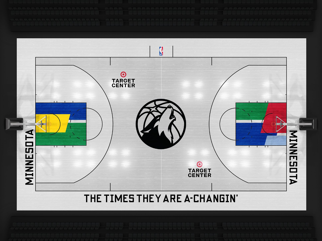
Designed by Casey Vitelli (@caseyvitelli)
Some notes on the Wolves’ City Edition court concept:
-Inside the 3-point line is white to match the jerseys, whereas outside the 2-point area is a subtle grey to allow the jerseys to stand out more in transition.
-The center court logo uses the team’s secondary logo as opposed to the typical primary logo.
-The painted area beneath the foul line matches the randomized color pattern featured on the leaked jerseys.
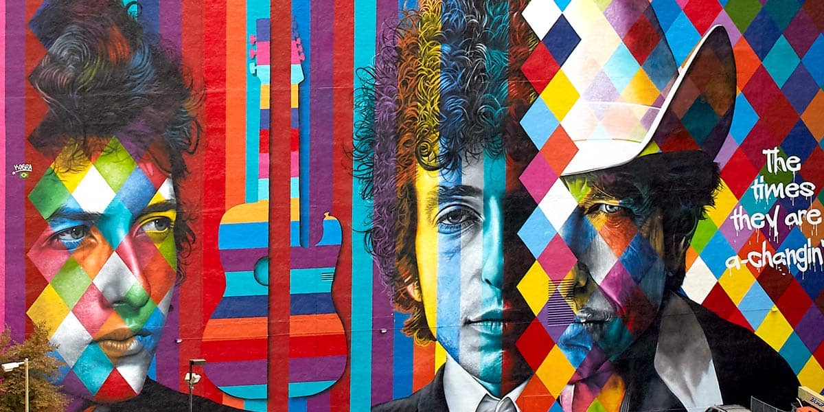
-The term “THE TIMES ARE A-CHANGIN'” along the sidelines gives respect to the Bob Dylan Mural in downtown Minneapolis, which is reportedly the inspiration behind the jerseys’ design. The term also signals a new era of Timberwolves basketball, highlighted by new ownership, operations, and players
With the Minnesota Timberwolves looking to follow up last year’s success with an even better performance, all eyes will be on the team’s actual on-court production rather than the uniforms they will be sporting. Still, the times are a-changin’ for Minnesota basketball. The team now features two All-NBA centers and one of the most exciting young players the league has to offer — something we haven’t seen in the Twin Cities.
With the Timberwolves scheduled to be on the big screen of nationally televised games for 16 times this year, it’s a shame that they’ll likely be forced to wear the bland, Lego-like design. But if the team can give its stars a decent setting for the expected blockbuster-like season, the fans may be more amenable to the leaked design.
***
A special thank you to Casey Vitelli for the City Edition court concept. Be sure to check out Casey and his work on both Twitter and YouTube for more NBA design concepts and input.