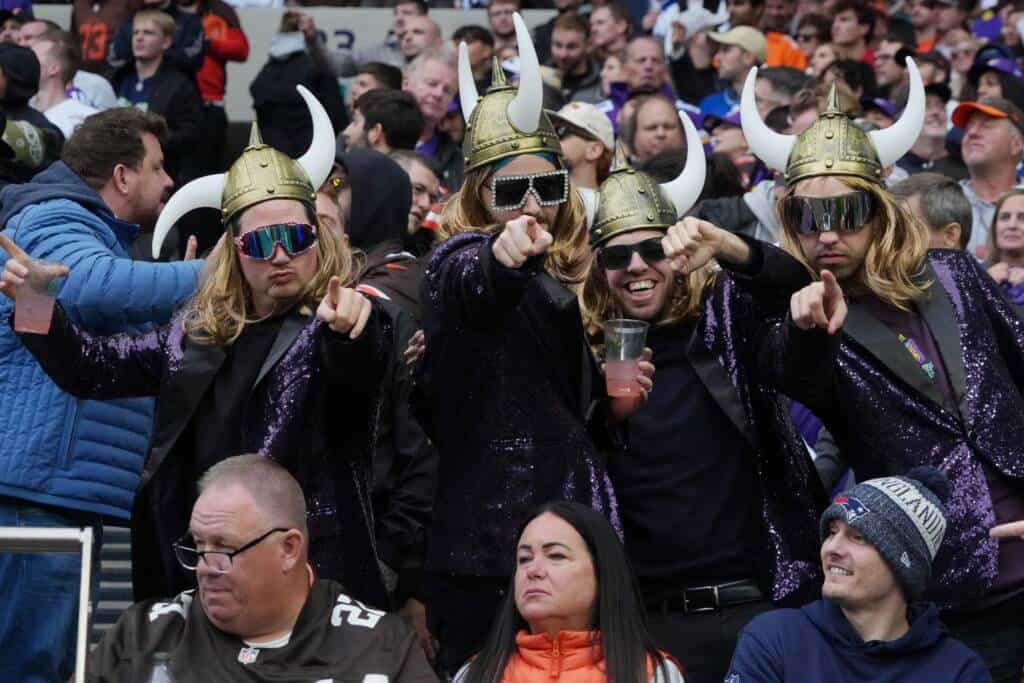
It’s that time of the year when football fans are bored. You may be reading this article at a cabin right now, discussing with your friends whether the Minnesota Vikings will bounce back next year. You may even be sitting around a campfire, attempting to name random Vikings players. Or you could be arguing about their uniforms.
The Vikings uniforms are iconic in look, but their modern version has caught some strays. In an article by SI’s Mike Kadlick, Minnesota ranked 24th in the NFL with their current jerseys, citing a “basic” look and winged numbers that “throw them for a strange loop.” Many fans agree with that take, hoping that the Vikings give their uniforms “a refresh” in the near future.
But taking a step back and looking at the rest of the league, the Vikings’ jerseys don’t need fixing.
This entire discussion could fall into age-based categories. If you’re over the age of 45, you probably love the purple and white with hints of gold from the 1970s and 1980s. Those a little closer to a mid-life crisis probably want the white away jerseys with the purple-and-gold shoulder stripes that Cris Carter and Randy Moss made famous in the late ‘90s and early 2000s.
Then there’s the younger demographic who has been largely associated with the current jerseys. They’ve grown up with them through the Minneapolis Miracle and Kyle Rudolph’s game-winning touchdown in 2019. They ushered in the Mike Zimmer era and have been there through Kirko Chainz to Kevin O’Connell’s postgame speeches. It’s been a while since they changed their look, but it might not need to.
Look at the last time the Vikings made a drastic change to their uniforms. In 2006, the Wilf family wanted to put their stamp on the team after purchasing it from Red McCombs. While the purple-and-gold look was iconic, the Vikings tried something different, and it failed spectacularly.
There are so many things wrong with the Vikings’ uniforms they wore throughout the 2012 season. The gold piping around the collar was unnecessary. The white shoulder stripes, meant to resemble a Viking horn on the sides, were overkill. The glossy helmets were distracting. The result was a uniform that looked like the Denver Broncos had a baby with the Vikings, producing something only a Nike executive could love.
But the biggest bummer was that these uniforms defined one of the more intriguing eras in franchise history. Adrian Peterson and Jared Allen were two Vikings legends who spent most of their careers in this jersey. Brett Favre also donned this monstrosity for a couple of years. It was so bad that younger fans associate his time in Minnesota with 1960s throwbacks.
Even the throwbacks weren’t perfect. The Athletic’s Alec Lewis dubbed them the worst in franchise history for their blandness. But the way fans think of those throwbacks highlights that if it ain’t broke, don’t fix it.
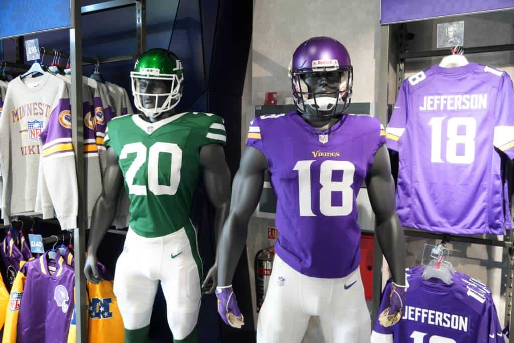
The Vikings have a unique look, and it begins with their colors. When you see someone wearing purple, there’s a good chance they’re a Vikings fan. If it weren’t for the Cleveland Browns becoming the Baltimore Ravens in 1996, the Vikings would have the purple scheme all to themselves.
Sharing isn’t a bad thing, but it can get to the point where it’s unimaginative. Thirteen different NFL teams have some shade of blue in their primary colors. Ten teams have a shade of red. Five teams have a blue-and-red color scheme: the Buffalo Bills, New England Patriots, Tennessee Titans, New York Giants, and Houston Texans. Meanwhile, the two teams with blue-and-yellow color schemes — the Rams and Chargers — share a stadium in Los Angeles.
The point is that even if the Vikings have a bland look, their colors will make them stand out. Still, it hasn’t stopped fans from wanting a black jersey to join the rotation, but that takes away from the uniqueness with nine different teams using black as a primary color.
The winged numbers also help an alternate jersey pop. While Kadlick isn’t a fan of Minnesota’s primary set, he called the Vikings’ “Winter Whiteout” jerseys one of the best alternates in the NFL, even though they use the same font some fans can’t stand.
There is also a way to refresh without messing with the primary set. The alternates are one example, and the Vikings will unveil a “Rivalries” concept that will be worn at some point during the 2026 season.
With other avenues available, it seems like an unnecessary exercise to refresh the Vikings jerseys. We’ve already seen what it can do when it goes wrong. The funniest part is that the Vikings didn’t even get Nike’d the same way the Browns, Atlanta Falcons, and Seattle Seahawks have at one point or another.
But in the slowest part of the offseason, the uniforms remain a hot topic. Hopefully it’s a debate that stays up at the cabin.